
Modern product teams rarely keep color in one place. A launch page may start in Figma, move into a design-token repository, appear in a mobile app, become a product image in a CMS, and finally end up on packaging, event signage, or a sales brochure. Every step introduces a small risk: a copied HEX value, an outdated brand guide, a print file built from the wrong CMYK mix, or a designer manually guessing the closest Pantone chip.
For companies that rely on APIs and automation, color should be treated like any other structured business asset. If pricing, inventory, user consent, and analytics deserve validated pipelines, brand color deserves the same care. Consistent color data protects recognition, reduces review cycles, and makes automated asset production easier to trust.
Why color becomes an API problem
Color looks simple because it is often represented by a short value such as #005EB8. In practice, that value may be only one expression of a larger decision. A brand color can have a screen value, a print process value, a spot-color reference, a dark-mode adjustment, and accessibility-specific variants. Once those values travel between systems, they need names, metadata, ownership, and rules.
The problem becomes visible when teams automate content generation. A CMS template may request a primary brand color from a design-token API. A print vendor portal may need CMYK. A marketing workflow may generate hundreds of localized banners and landing pages. A mobile app release may pull the same palette into native code. Without a shared source of truth, automation simply repeats mistakes faster.
The three color languages teams usually mix
| Format | Best use | Automation risk |
| HEX | Web, mobile UI, CSS, email templates, design tokens | Screen colors are device-dependent and can be copied without context. |
| CMYK | Process printing, brochures, packaging, printed sales collateral | Some bright screen colors print duller, so approval cannot be purely mathematical. |
| Pantone | Spot-color identity, premium print, production conversations | Pantone references need physical validation and may not map exactly to digital values. |
A useful automation workflow does not pretend that HEX, CMYK, and Pantone are interchangeable. It records how they relate, where each value is allowed to be used, and when human review is required. That is the difference between a helpful pipeline and a color roulette wheel.
Build a color source of truth before scaling assets
The most reliable setup is a small color registry that sits beside the design system rather than inside one design file. Each entry should include the color name, role, HEX value, CMYK equivalent when approved, Pantone reference when relevant, accessibility notes, and timestamps for review. This registry can be a JSON file, a CMS collection, a database table, or a design-token package, as long as it is versioned and easy for downstream systems to consume.
A color registry also gives APIs something stable to return. Instead of letting every integration ask for “blue,” the API can return “brand.primary.blue” with the exact fields required for the channel. Web templates receive HEX. A print brief receives CMYK and Pantone notes. QA tools receive expected values for screenshot checks.
Minimum fields worth tracking
- A human-readable color name and a stable machine key.
- Approved HEX for digital products and web assets.
- CMYK values for print workflows, with the date and source of approval.
- Pantone candidate or approved spot-color reference, when brand or production teams need one.
- Usage notes such as “UI only,” “print only,” “do not use on dark backgrounds,” or “requires proof before production.”
Where a Color Finder fits into the workflow
Even with a registry, teams often need to bridge formats during handoff. A designer may receive only a website HEX token and need a practical Pantone starting point. A production manager may need to translate a Pantone reference into CMYK for a process-print quote. A developer may need to verify that a CMS value still matches the intended digital equivalent.
Thats where Hue.ink can support the workflow: its Pantone, HEX, CMYK, and Color Finder utilities help teams compare color formats before values are committed into automated pipelines.
The important word is “before.” Conversion tools should be used as decision support, not as silent production authority. A good pipeline records the selected value, shows the source, and routes color-critical work through proofing when physical output matters.
API design patterns for color consistency
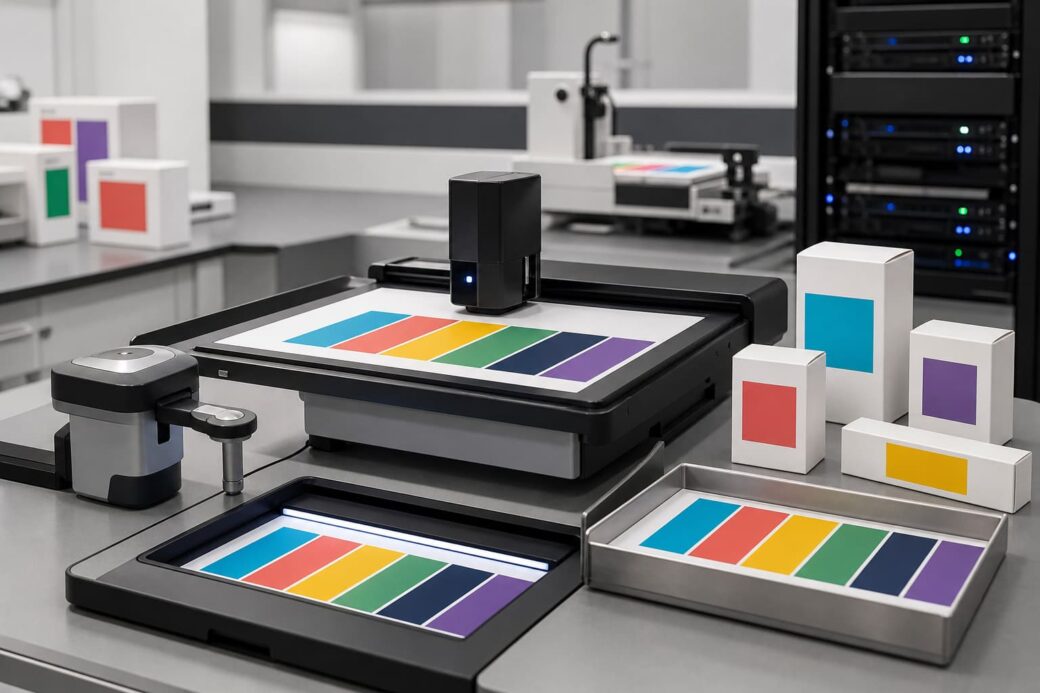
Color data should be boring to consume. If an application has to guess which field to use, the API has failed. Keep the response shape predictable and separate channel-specific values clearly. A web client should not need to parse print notes, and a print workflow should not have to reverse-engineer CMYK from HEX.
Return channel-ready values
A simple endpoint can expose a color by key and include only the fields a client needs. For example, a web integration might request digital values, while a print integration requests production values. This avoids overloading every consumer with the entire color model.
Version color decisions
When a brand refresh changes a palette, old assets do not vanish. APIs should expose versioned color sets so archived templates, old campaigns, and active products can remain stable until they are intentionally migrated.
Validate inputs early
Automation should reject malformed HEX values, missing CMYK components, unsupported color roles, and unapproved Pantone references before an asset is generated. Fast failure is cheaper than discovering a mismatch in a printed batch or a live app release.
A practical automated color workflow
- Define approved color roles in the design system and assign stable machine keys.
- Store channel-specific values in a versioned registry that can be read by APIs.
- Use conversion and matching tools to create candidates, then mark approved values explicitly.
- Expose only the relevant fields to each downstream system: web, app, CMS, print, or analytics.
- Run automated checks for missing values, invalid formats, and unexpected palette drift.
- Require manual proofing for color-critical print or packaging work.
Security and governance are part of the color story
Color values may not feel sensitive, but the workflows around them often touch unreleased campaigns, product launches, and partner materials. Access control still matters. Only trusted users and services should be able to change approved brand colors. Every update should leave an audit trail showing who changed what, when, and why.
This is especially important when color data is distributed through APIs. A small accidental change to a token can cascade into app builds, landing pages, email campaigns, and print exports. Treating color as governed data reduces the blast radius.
Final thoughts
Color consistency is not only a design concern. It is an automation concern, an API concern, and a production concern. The teams that handle it well do not rely on memory or screenshots. They create a structured source of truth, validate it, version it, and give every system the right value for its channel.
When HEX, CMYK, and Pantone are managed with the same discipline as other operational data, automated workflows become faster and less risky. The result is a brand that looks intentional everywhere: on screen, in print, and across every API-driven handoff in between.